A Full Brand Overhaul for Noodle, PBC

A comprehensive brand update that gave Noodle a sharper, more distinctive identity in the higher education space — new brand and editorial guidelines, a redesigned website, and a built-from-scratch visual and photo library.

My Role

Creative Director

Team

Art Director, Production Designer, Copywriter, Editor

Deliverables

Brand Guidelines, Website, Visual & Photo Libraries

01 — The Problem

Safe Wasn't Working

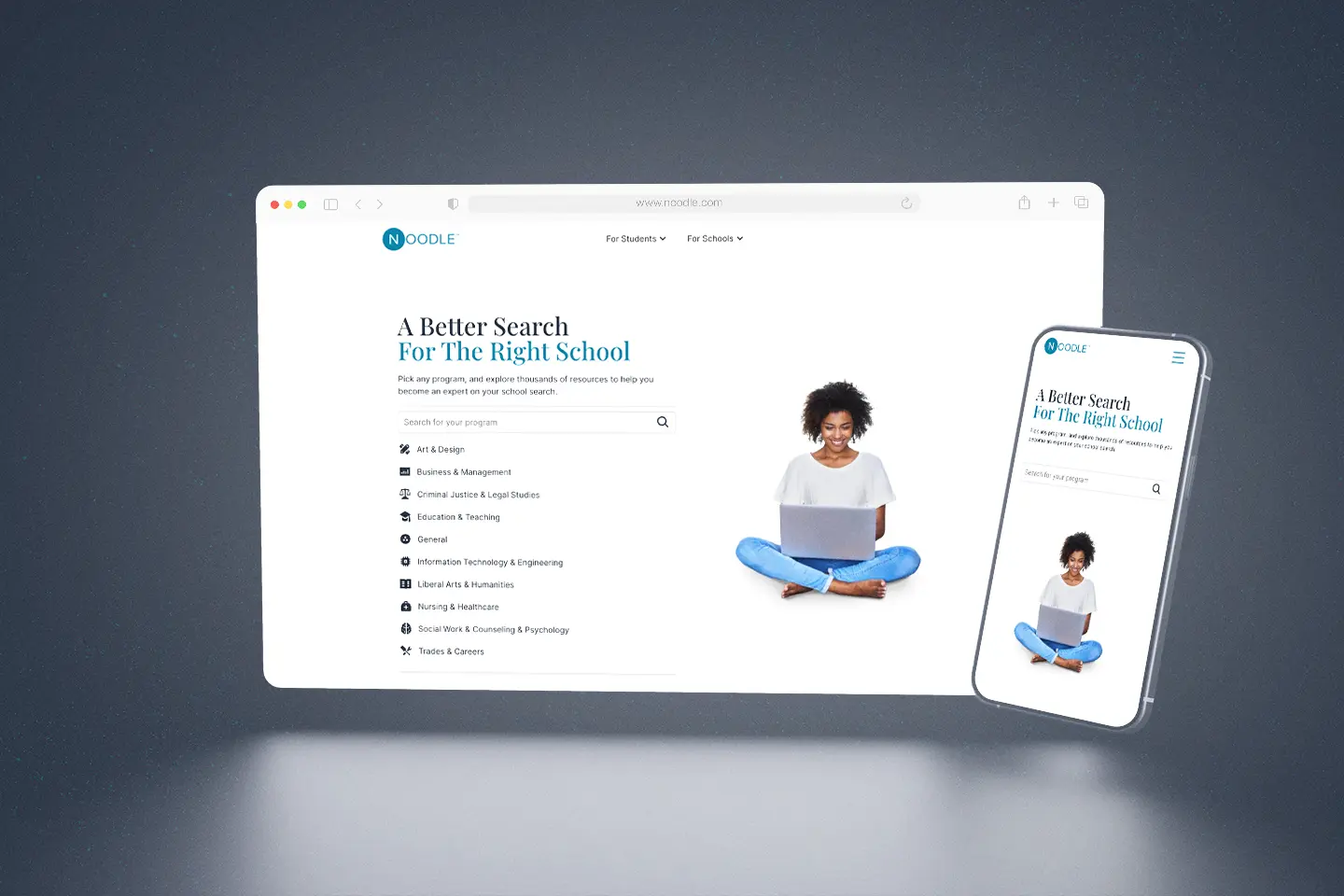
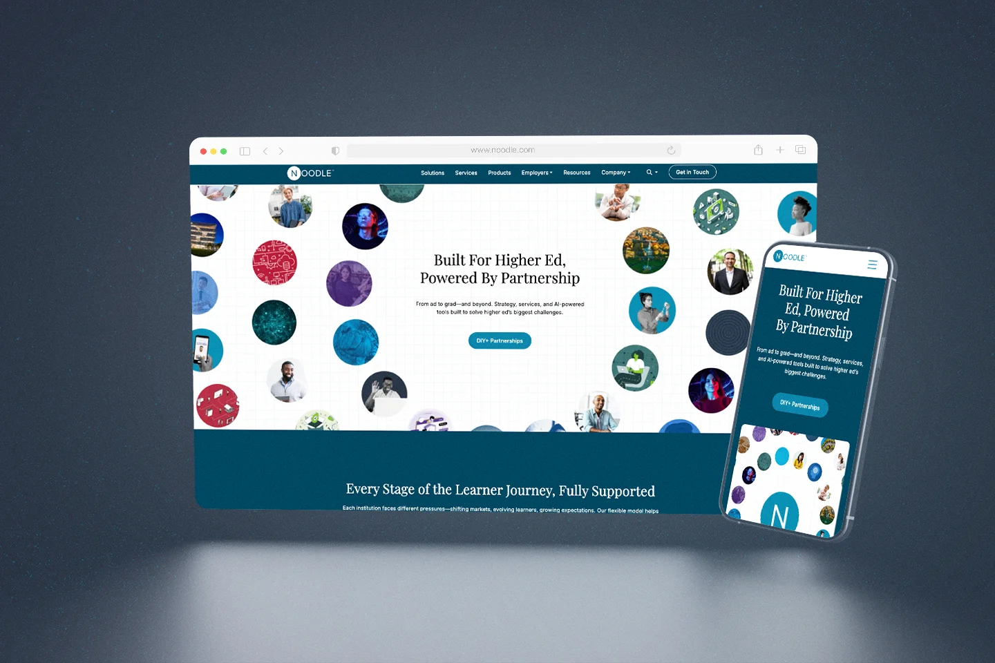
The higher education service and technology space is crowded with brands that look the same — safe blues, generic photography, and cautious messaging that could belong to any company in the category. Noodle was no exception. The existing brand had been built incrementally, resulting in a fragmented identity that lacked the clarity and confidence needed to compete. The old website made it worse — a prospective partner landing on the site had to work to understand what Noodle actually did.

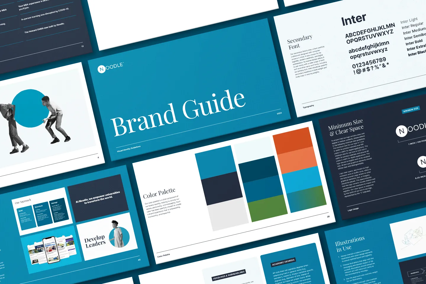
Leadership recognized the problem and brought in two external vendors — one for the brand, one for the website. Neither delivered what was needed. My team and I stepped in where the outside work fell short, built the case for a bolder direction, and earned the opportunity to lead the overhaul — presenting to leadership at each stage to prove our approach was the right path forward.

Key Objectives

Create a bold, ownable visual identity that stands out in the higher education service and technology space — not a safe refresh, but a genuine rethinking

Build a complete brand and editorial style guide to govern consistency across all internal teams and external touchpoints

Redesign the website with clearer information architecture and a stronger hierarchy that helps prospective partners understand Noodle’s offerings immediately

Build a graphic and photography library with original, on-brand assets — replacing generic imagery with visuals that were uniquely Noodle

02 — Process & Approach

Built From the Ground Up

With no predetermined direction and a blank slate, my team and I built the entire engagement from scratch — strategy, visual identity, editorial standards, website architecture, and original photography. As Creative Director, I set the creative direction across every workstream, made the key decisions on how bold and distinctive to push each element, and personally contributed to the design of core brand assets. The scope was wide, but the point of view was singular throughout.

Noodle-Editorial-Guide-Mockups

Brand & Editorial Guidelines

The brand overhaul covered the full visual and verbal identity — refined logo usage, an expanded color system, a Playfair Display and Inter type pairing, and a scalable graphic library built around Noodle’s circular motif and a distinctive continuous-line illustration style rooted in the brand’s own name. Alongside the visual work, we built a complete editorial style guide: AP style conventions, Noodle-specific naming standards, tone guidelines, and inclusive language principles — giving every team a single source of truth for how Noodle communicates in writing.

Noodle-Brand-Brochure

Website Redesign

The old site made prospective partners work to understand what Noodle offered. The new site was built around a clear content hierarchy — leading with what Noodle does, for whom, and why it’s different — before moving into the depth that larger decisions require. My team and I led the UX strategy, content architecture, and design execution, ensuring that the visual system and the information design worked together rather than competing.

The result was a site that communicated Noodle’s full-funnel service offering — from marketing and enrollment to learning design and student support — in a way that was immediately legible to a university partner evaluating options.

Noodle-Brand-Website-3
Noodle-Brand-Website-2

Photo & Video Shoot Direction

Generic stock photography was one of the most visible symptoms of the old brand’s weakness. To fix it properly, we needed original imagery — shot specifically to match the new brand’s visual treatment and tone. I planned and directed the photo and video shoot from pre-production through on-site execution, ensuring the resulting library could support the website, sales decks, campaign materials, and product environments for years.

Noodle_1-30BrandShoot-5050
Noodle_1-30BrandShoot-6973
03 — The Solution

A Brand Worth Remembering

The finished work gave Noodle something it hadn’t had before: a complete, confident, and cohesive identity that could hold up across every surface — from a cold outreach email to a conference keynote to a product demo environment. The brand was distinctive not just in its visual choices, but in its underlying logic — a consistent point of view that ran from the illustration style through the editorial voice through the photography treatment.

The website gave prospective university partners a dramatically cleaner path to understanding what Noodle does and why they should care. The information architecture was rebuilt around the buyer’s journey rather than Noodle’s internal org structure, which made the difference between a site that educates and one that overwhelms.

Noodle-Brand-Postcard
Noodle-Brand-Business-Card