A fully realized fictional university identity — logo suite, brand guidelines, photography, iconography, textures, and mascot — designed to power Noodle’s product mockups and sales materials.
Creative Director & Lead Designer
Art Director, Production Designer, Editor
Logo, Guidelines, Photography, Icons, Textures, Mascot
Noodle’s products live inside a Noodle-branded environment — the website, sales decks, demo environments — all built around Noodle’s signature blue-heavy palette. For years, product mockups used a combination of Noodle branding and a stand-in called Penne University, which was also styled in Noodle colors. The result was visually confusing: when a potential partner or client looked at a product demo, it was nearly impossible to tell where Noodle’s brand ended and the product itself began.
For a company whose entire value proposition is helping universities present their programs effectively, that kind of visual noise was a liability. The mockups needed a fictional university brand distinct enough to read as a separate institution — but not so jarring that it clashed with the Noodle environment surrounding it.
Create a fictional university identity distinct enough to visually separate from Noodle’s brand in shared demo environments
Use a color palette that reads as its own identity without clashing against Noodle’s blue-dominant brand
Build the brand out fully enough to populate realistic, believable product mockups across multiple use cases
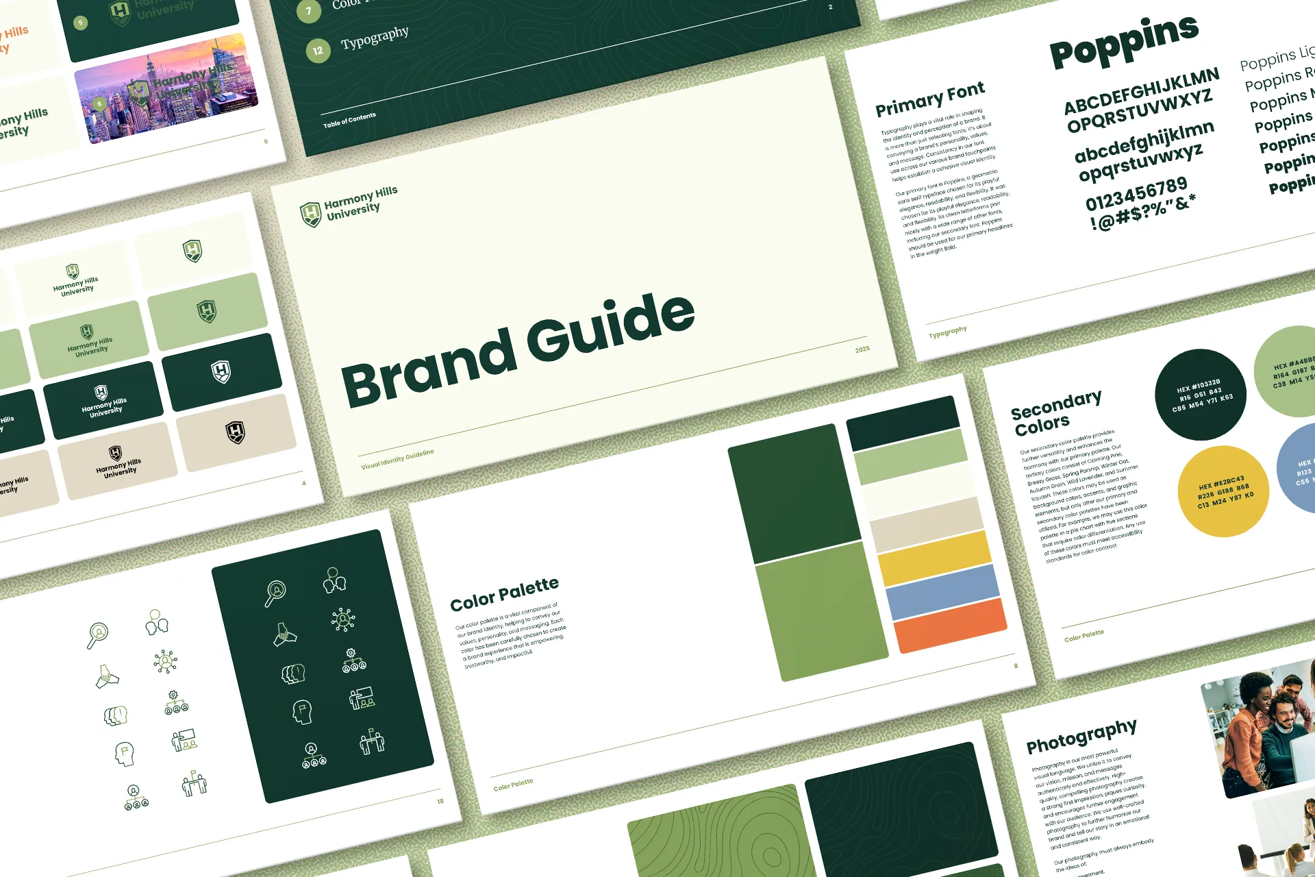
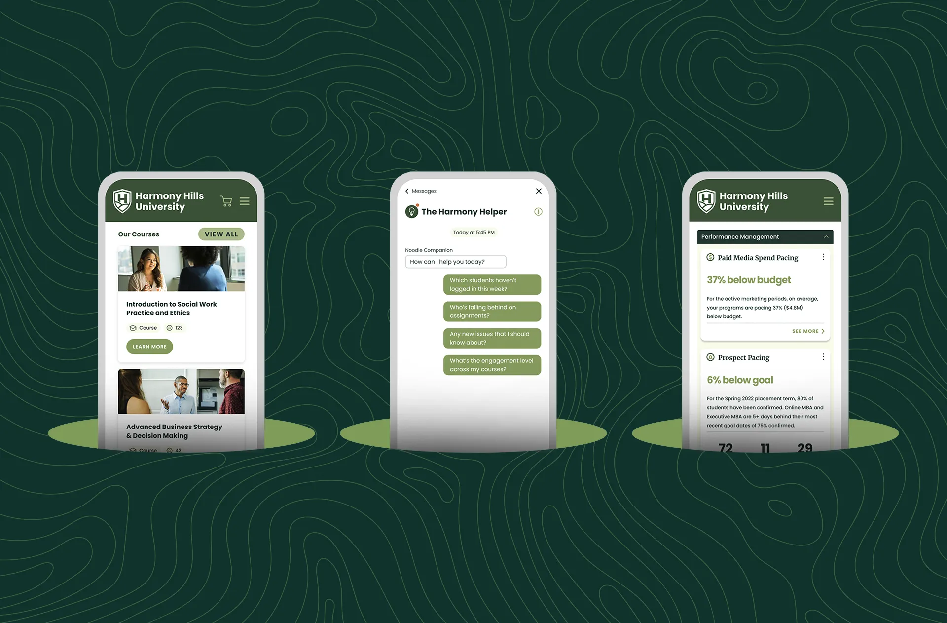
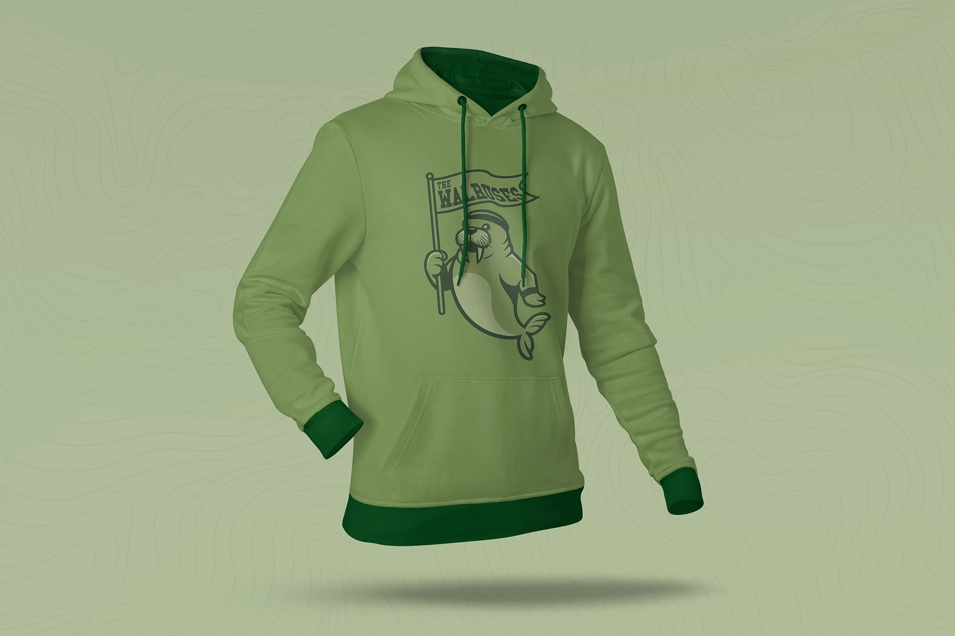
The brand needed to feel credible and complete — not like a placeholder. A thin identity would draw attention to itself and undermine the demo’s purpose. That meant building the full apparatus: color system, typography, graphic language, photography treatment, iconography, texture library, and a mascot for Noodle’s chat interface.
As Creative Director, I set the strategic and visual direction for the entire system and personally designed the logo suite — a hands-on role beyond my typical CD scope, but the right call for an internal project where cohesion and speed mattered equally.
From there, the logo’s hillside shield mark became the foundation for everything else: the topographic textures, the line-weight of the icon set, the shape language used across brand materials. Every element traces back to the same visual idea, giving the brand the kind of internal consistency that makes a fictional institution feel real.
Harmony Hills University gave Noodle’s product team a complete, credible institutional identity to work with — one that reads as its own brand the moment it appears alongside Noodle’s, eliminating the visual confusion that had made earlier demo environments harder to parse.
The depth of the system means it can populate any product surface convincingly: a landing page mockup, a branded chat interface, a course catalog, a slide deck. Because the brand was built with the same rigor as a real client engagement — full color system, typography, guidelines, photography treatment, icons, textures, mascot — it holds up under scrutiny in a way that a lightweight placeholder never could.